Industry work
A forecast you could plan around.
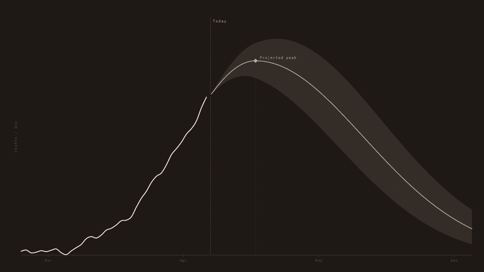
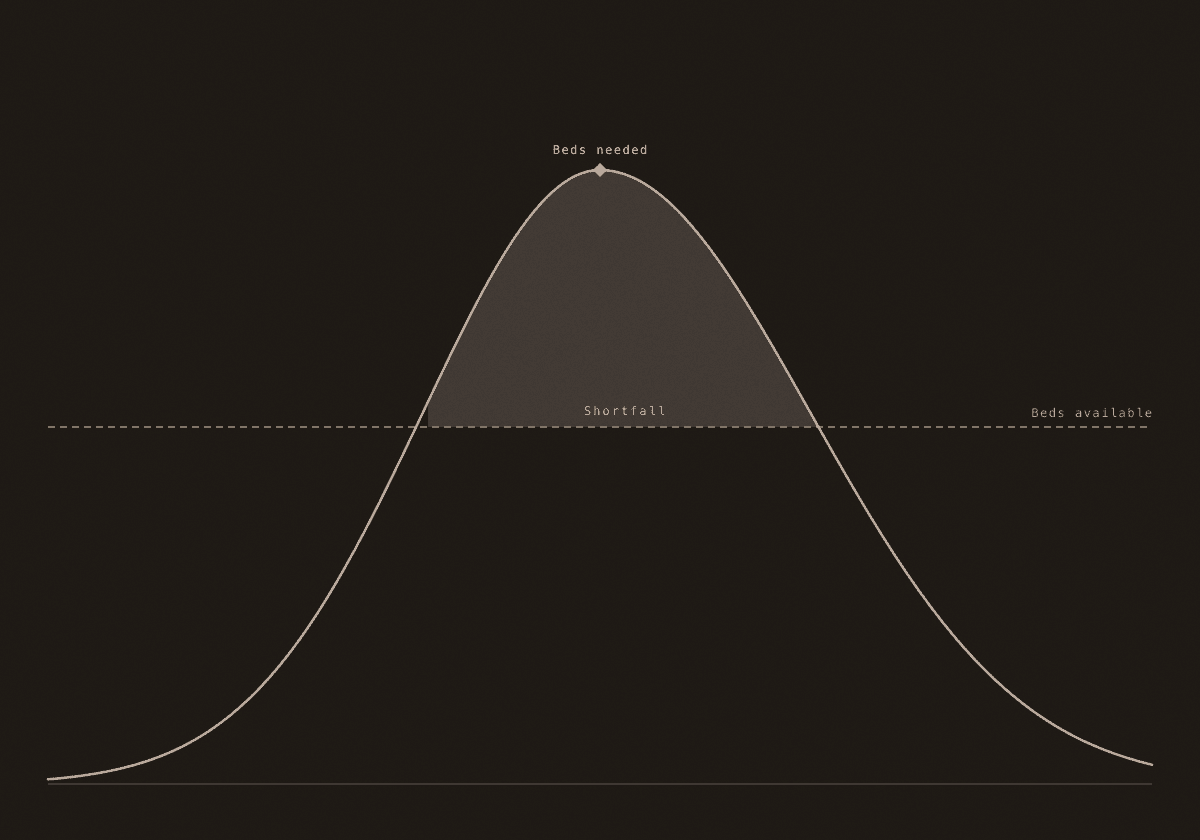
One of the first public forecasts of when COVID-19 would peak — and whether hospitals would have the room to meet it.
- Role
- Data viz · design eng
- Year
- 2020
- Org
- IHME · UW
How it was made
A daily forecasting model, made readable in seconds.
In 2020 I was at IHME: projected deaths and hospital demand for every U.S. state, then every country, each shown as a range rather than one confident number. The first public version shipped in weeks. We rebuilt it every day after that.
Reach
- Ran daily in national and global news.
- Used by millions, and briefed by the White House.
Why it stuck
Most dashboards counted what had already happened.
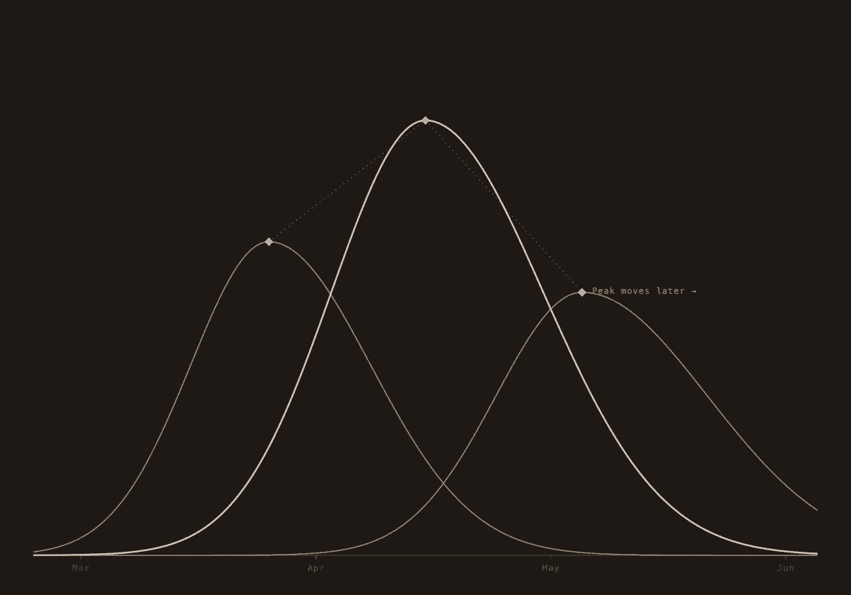
This was one of the first to put a date on the peak: when each place would crest, and whether its hospitals would have room.
Same idea as my transit work: the forecast people can act on isn’t the most confident one, it’s the one that’s honest about how wrong it might be.
Michael Fernandes
0
500 PX